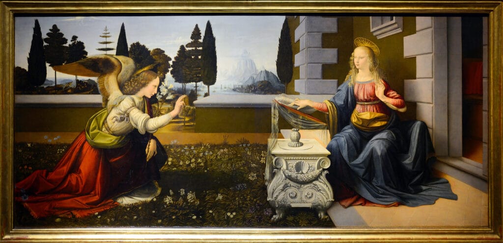

The Perspective “Error” in Leonardo da Vinci’s Annunciation: Intentional or Mistake?
In Leonardo da Vinci’s Annunciation, curious perspective issues have puzzled art historians and enthusiasts alike. Observing the painting closely, one notices that the Virgin Mary’s right arm appears longer than her left, while her legs seem disproportionately short compared to her torso. Additionally, a cypress tree seems to blend with a nearby building, giving it an exaggerated size. These “errors” result from the positioning of Mary’s legs and shoulders relative to the lectern. When viewed from the top half, Mary seems positioned further back, yet from the lower half, she appears in the foreground. This unusual perspective plays a significant role in the viewer’s perception of the scene.
Can We Compare Leonardo’s Annunciation at the Uffizi with the Louvre Version?
Interestingly, a comparison with Leonardo’s other Annunciation, located in the Louvre, is challenging. In the Louvre version, the Virgin Mary is depicted with her arms crossed over her chest, creating a different visual and emotional effect. This difference in posture means the two paintings follow distinct compositional structures, which further complicates direct comparison.
An Alternative Theory: Intentional Anamorphic Perspective in Leonardo’s Annunciation
Antonio Natali, former director of the Uffizi, proposed an alternative interpretation, building on ideas by renowned Leonardo expert Carlo Pedretti. According to Natali, Leonardo’s perspective “errors” might be intentional. Observing Annunciation from a right-side angle reduces the apparent disproportion in Mary’s arm—a technique known as anamorphosis. This optical technique, previously used by artists like Donatello and Filippo Lippi, appears in Leonardo’s notebooks, where he explored perspective distortions.
Did Leonardo Design the Perspective for a Specific Viewing Angle?
Some art historians speculate that Leonardo may have painted Annunciation with a particular display setting in mind, perhaps envisioning it hung on a wall where it would mainly be viewed from the right. By applying anamorphosis, Leonardo could achieve a more harmonious effect from this viewpoint, further enhancing the depth and realism of the scene. This consideration adds another layer of sophistication to Leonardo’s work, revealing his mastery of perspective and his innovative approach to Renaissance art.


